


What makes a good product label? Much thought and care go into making a high-quality label that makes a statement. So making your product look interesting and inviting when it hits the shelf isn't just going to happen by chance.
But where does a business owner start when they're creating a new product label? This guide will get under the hood of a successful label and talk about which elements set it apart from the rest of the pack.
Think About Your Target Demographic
Who are you selling this product to? Answering this question for yourself will inform the rest of your decisions. Everything from font to color to graphics will be influenced by the type of person you're trying to appeal to. So make sure you know what that person looks like, and be faithful to them to capture their attention and business.
Be Unique
Your product labels should be uniquely yours - avoid using any designs or characteristics that could be confused with other products. That said, you should still look at your competitors' product labels. Knowing what they look like can help prevent you from creating something similar while sparking some inspiration to help propel you forward into clever ideas.
Emphasize Your Brand
If you have a particular brand direction or logo, putting it front and center on your label can help customers recognize your product and become familiar with it. The more aware your customer is of what they're looking at, the easier it will be for them to associate it with your product. And using logo-focused branding is also excellent for staying original since you'd be building the product label around something unique to your business.
Make it Readable
A straightforward design is crucial, but the consumer will also need to read the label, so they know what they're buying. Flowery or ornamental text can be distracting or difficult to read, especially from further away. While some demographics may appreciate this approach, it's all about knowing your audience while not sacrificing legibility.
The text size is also something to consider - keep any text on the label in a six-point font or above. You can play with color here to help specific text pop for a more clever design, provided the color scheme is in line with your brand's style.
Use White Space to Your Advantage
A label can be full of text, graphics, and other elements. But the white space is equally as important, sort of like moments of silence in music. White space will help separate elements and information to make your label easier to read.
It's also an excellent way to drum up some visual interest, as the eyes will feel like there are "landing pads" for them as they read the label. White space is also necessary if you're trying for a more modern or minimalist product label. It's a more sophisticated look and pairs well with simple, streamlined text or images.
Practicality Before Originality
It's always good to stand out from the crowd whenever you can. But that shouldn't come at the cost of the label's success. Product labels should be equal parts marketing and source of information, with a dash of artistry. You can start playing around with more out-of-the-box ideas as long as all the necessary details can be easily found and understood.
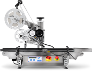
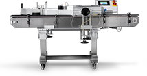
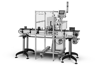
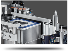
Label application also matters here. You'll want to make sure your labels look great every time. It won't matter much to a prospective customer how cool your design is if the label application looks messy.
High-quality labeling equipment can assist with this by ensuring your product labels are always uniform. If you're in the market for labeling equipment and need help figuring out where to start, download our Practical Guide to Choosing Labeling Equipment. This free guide will direct you to excellent options that fit your unique needs, so you can spend more time focusing on the fun of designing your new label!